
By Rahul Dhakate · PMP & PSM I Certified · 29 May 2026 · learnxyz.in
The burndown chart is one of the most recognisable visualisations in Agile project management and one that the PMP exam tests specifically. If you have seen a graph showing a downward-sloping line tracking remaining work against time, you have seen a burndown chart.
It is also one of the metrics most frequently discussed in theory but most flexibly applied in practice. Understanding both — the textbook definition for the exam and the real-world variation in how teams actually track sprint progress — will serve you well in both contexts.
Table of Contents
Reading the Burndown Chart — What the Lines Tell You.
Sprint Burndown vs Release Burndown.
Burndown vs Burnup — An Important Distinction.
How Teams Actually Track Progress in Practice.
Velocity — The Related Metric You Must Know..
How Burndown Charts Are Tested on the PMP Exam..
What is a Burndown Chart?
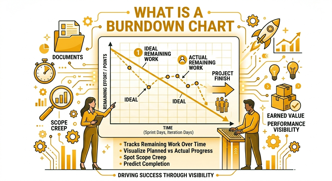
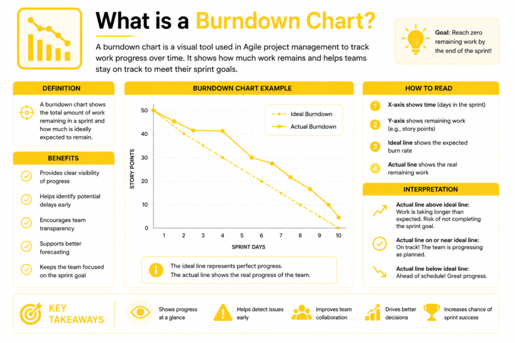
A burndown chart is a graphical representation of remaining work versus time. It shows how much work is left to complete in a sprint or release, and whether the team is on track to finish within the time-box.
The chart has two axes:
- Y axis (vertical): Remaining work — measured in story points, hours, or number of tasks depending on the team’s preference
- X axis (horizontal): Time — sprint days (for a sprint burndown) or sprint number (for a release burndown)
Two lines appear on the chart:
- The ideal burndown line: a straight diagonal line from the total work at sprint start (top left) to zero at sprint end (bottom right). This is the theoretical pace at which work should be completed if progress is perfectly linear.
- The actual burndown line: the real line showing actual remaining work each day. It is rarely a straight diagonal — it reflects the reality of how work actually progresses.
Reading the Burndown Chart — What the Lines Tell You
| Actual Line Position | What It Means | PM Action |
| Above the ideal line | Behind schedule — more work remaining than planned at this point | Investigate blockers. Consider descoping lower-priority stories. Raise in next standup. |
| Below the ideal line | Ahead of schedule — less work remaining than planned | Consider pulling additional stories from backlog. Confirm quality is not being sacrificed for speed. |
| Following the ideal line | On track — team is completing work at the expected pace | Monitor for consistency. Maintain current pace. |
| Flat for multiple days | Work has stalled — no tasks being completed | Urgently investigate. Team may be blocked on a dependency or facing a hidden impediment. |
| Sharp drop then flat | Stories were completed quickly then work stopped | Check whether remaining stories are dependent on unresolved external items. |
Sprint Burndown vs Release Burndown
There are two types of burndown charts used in Scrum teams, and the PMP exam distinguishes between them:
| Type | X Axis | Y Axis | Purpose | Updated |
| Sprint Burndown | Days of the sprint | Remaining work in current sprint (story points or hours) | Track daily progress toward the sprint goal | Daily — after each Daily Scrum |
| Release Burndown | Sprint number | Remaining work in the entire product backlog | Track progress toward the release date across multiple sprints | End of each sprint |
The Sprint Burndown is the operational tool — the Scrum team reviews it daily. The Release Burndown is the strategic tool — product managers and stakeholders use it to forecast when all planned features will be delivered.
Burndown vs Burnup — An Important Distinction
The burndown chart’s counterpart is the burnup chart. They measure related things in opposite directions:
- Burndown chart: tracks remaining work — starts high and should trend toward zero
- Burnup chart: tracks completed work — starts at zero and should trend toward the total scope line
The burnup chart has one significant advantage over burndown: it makes scope changes visible. When new stories are added to the sprint or release, the total scope line on a burnup chart goes up — making the scope increase obvious. On a burndown chart, adding scope resets the starting point in a way that can obscure how much the scope has grown.
For the PMP exam: burnup charts are better for communicating scope changes to stakeholders because they show both progress and scope changes simultaneously. Burndown charts are simpler for daily team use. Know the difference and when each is more appropriate.
How Teams Actually Track Progress in Practice
In my experience across multiple Agile projects at Valethi Technologies and Amla Commerce, the burndown chart as a formal daily artefact was used inconsistently. What teams actually relied on was a combination of:
- Daily standup updates — team members reporting verbally on progress and blockers, giving the Scrum Master and PM a real-time sense of sprint health
- Velocity tracking — measuring how many story points the team completed per sprint over time, which becomes the primary input for sprint planning and release forecasting
- Weekly team updates — a short written update on percentage completion against the sprint plan, flagging any stories at risk
The key metric we relied on most was team velocity — the consistent output of the team within a specific timeframe. By understanding velocity over several sprints, we could predict how many stories the team could realistically complete in the next sprint. This was how we selected user stories for sprint planning — choosing only those that fit within the team’s demonstrated capacity, not an aspirational target.
This real-world pattern reflects what research on Agile practices consistently shows: teams use the tools that are most visible and most immediately actionable. The burndown chart, when it is actively maintained and reviewed in standups, is an effective communication tool. When it is maintained only for reporting purposes and nobody looks at it daily, it loses its value.
The burndown chart is a team communication tool, not a management reporting tool. Its value comes from the team using it to self-manage their sprint progress — raising concerns when the actual line diverges from ideal, and making daily decisions based on what it shows. A burndown chart that lives in a project management tool and nobody looks at is a bureaucratic artefact, not an Agile asset.
Velocity — The Related Metric You Must Know
Velocity is the amount of work a Scrum team completes in a sprint, measured in story points. It is calculated at the end of each sprint by summing the story points of all completed stories.
Velocity is used for:
- Sprint planning — selecting stories whose total points fit within the team’s average velocity
- Release forecasting — dividing total remaining backlog points by average velocity gives an estimated number of sprints to complete the backlog
- Team capacity assessment — comparing velocity across sprints identifies trends: is the team getting faster, slower, or consistent?
PMP exam trap: velocity is team-specific and not comparable across teams. A team with 40 story points per sprint is not necessarily more productive than one completing 25 — the teams may calibrate their story point estimates differently. Velocity is only meaningful as a relative measure within the same team over time.
How Burndown Charts Are Tested on the PMP Exam
- Reading charts: Given a burndown chart image, identify whether the team is ahead of, behind, or on schedule. Use the actual line’s position relative to the ideal line.
- Burndown vs burnup: When is a burnup chart more useful? When scope changes are frequent and need to be visible to stakeholders.
- Flat line interpretation: The burndown line has been flat for three days. What does this indicate? Work has stalled — likely due to a blocker or impediment.
- Velocity questions: A team’s velocity has been decreasing over the last three sprints. What should the Scrum Master investigate? Team blockers, increasing story complexity, team member availability, or technical debt accumulation.
- Sprint vs release: What is the difference between a sprint burndown and a release burndown? Sprint measures daily remaining work within one sprint. Release measures remaining backlog across multiple sprints.
About the Author

Rahul Dhakate is a PMP and PSM I certified project manager and product management leader based in Nagpur, India, with 20 years of experience managing software projects across BFSI, eCommerce, and enterprise software. He tracked sprint progress across Agile teams using velocity-based planning and daily standup updates, adapting the burndown concept to the practical realities of distributed team delivery. He writes at LearnXYZ.in to help working professionals understand both the theory and the real-world practice of project management.
Next Article: