
A Comprehensive Guide with Realistic Examples
Navigating the world of stock market trading requires a deep understanding of various technical analysis tools, each designed to provide insights into market trends and potential trading opportunities. Among these tools, Renko charts stand out due to their unique approach to representing price movements. Unlike traditional candlestick or bar charts, Renko charts focus solely on price changes, filtering out time and volume elements. This distinct characteristic allows traders to identify trends more clearly, making it easier to spot potential buy and sell signals.
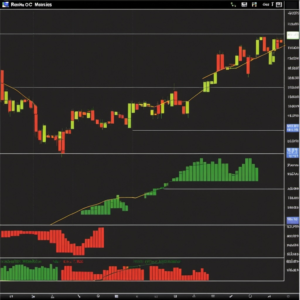
Renko charts, named after the Japanese word “renga” meaning bricks, use fixed-size bricks to represent price movements. Each brick is added to the chart when the price moves a specified amount, either up or down, without considering the time taken for this movement. This method of charting simplifies the visualization of market trends, providing a cleaner, less cluttered view that helps traders make more informed decisions.
The appeal of Renko charts lies in their ability to reduce market noise and highlight significant price trends. By focusing on substantial price movements, traders can better identify support and resistance levels, trend reversals, and continuation patterns. This makes Renko charts particularly useful for trend-following strategies, where the goal is to capitalize on sustained market movements.
In this article, we will delve into the mechanics of Renko charts, exploring how they are constructed and interpreted. We will also provide practical examples using realistic trading scenarios to demonstrate how Renko charts can be utilized in real-world trading. Whether you are a novice trader looking to expand your toolkit or an experienced investor seeking to refine your strategies, understanding Renko charts can offer valuable insights and enhance your trading performance.
What Are Renko Charts?
Renko charts are a type of chart used in technical analysis that focuses exclusively on price movements. Unlike traditional charts that plot price against time, Renko charts plot price movements based on a fixed box size, which is determined by the trader. This box size represents a specific price movement, and a new brick is added to the chart only when the price moves by this predetermined amount.
The construction of a Renko chart involves setting a box size, which could be a fixed dollar amount, a percentage of the current price, or a value derived from the average true range (ATR). When the price moves up or down by this amount, a new brick is added to the chart. An upward movement results in a white or green brick, while a downward movement results in a black or red brick.

How to Construct Renko Charts
Constructing Renko charts begins with choosing the appropriate box size. The box size plays a crucial role in the chart’s sensitivity to price movements. A smaller box size will result in more bricks and a more detailed chart, while a larger box size will filter out smaller price movements, providing a clearer view of major trends.
- Choose the Box Size: Decide on the box size based on your trading strategy and the volatility of the asset. Common methods include using a fixed dollar amount, a percentage of the price, or the ATR.
- Identify the Starting Point: Determine the starting point, which is usually the closing price of the previous day or a significant price level.
- Plot the Bricks: Add a new brick whenever the price moves by the chosen box size. If the price moves up, add a white or green brick above the previous brick. If the price moves down, add a black or red brick below the previous brick.
Interpreting Renko Charts
Renko charts simplify the identification of trends by filtering out minor price fluctuations. Here are some key points to consider when interpreting Renko charts:
- Trend Identification: A series of consecutive bricks of the same color indicates a strong trend. An uninterrupted sequence of white or green bricks signifies an upward trend, while a sequence of black or red bricks indicates a downward trend.
- Trend Reversals: A change in brick color often signals a potential trend reversal. For example, a switch from white or green bricks to black or red bricks may indicate the beginning of a downtrend.
- Support and Resistance Levels: Renko charts help identify support and resistance levels more clearly. These levels are formed by horizontal lines connecting the tops or bottoms of bricks where the price has repeatedly reversed.
- Trading Signals: Traders can use Renko charts to generate trading signals. For example, a buy signal may occur when a new white or green brick forms after a series of black or red bricks, suggesting a reversal to an upward trend.
Practical Example: Trading with Renko Charts
To understand how Renko charts can be used in real-world trading, let’s consider a realistic scenario involving the stock of a fictitious company, Tech Innovators Inc.
Step 1: Setting the Box Size
Suppose we decide to use a box size of $5 for Tech Innovators Inc. This means a new brick will be added to the Renko chart whenever the stock price moves up or down by $5.
Step 2: Plotting the Initial Bricks
The current stock price of Tech Innovators Inc. is $150. The first brick will be plotted at this level. If the price rises to $155, a new white or green brick is added above the initial brick. If the price falls to $145, a black or red brick is added below.
Step 3: Identifying Trends and Signals
Over the next few days, the price of Tech Innovators Inc. moves as follows:
- Day 1: $150 to $155 (New white/green brick added)
- Day 2: $155 to $160 (New white/green brick added)
- Day 3: $160 to $165 (New white/green brick added)
- Day 4: $165 to $160 (No new brick)
- Day 5: $160 to $155 (No new brick)
- Day 6: $155 to $150 (Black/red brick added)
At this point, the Renko chart shows three consecutive white/green bricks followed by a black/red brick, indicating a potential trend reversal from an uptrend to a downtrend.
Step 4: Making Trading Decisions
Based on the Renko chart, a trader might decide to sell their shares of Tech Innovators Inc. upon seeing the black/red brick, anticipating further price declines. Conversely, if the price resumes its upward movement and another white/green brick forms, the trader might buy back shares, expecting a continuation of the uptrend.
Advantages of Renko Charts
Renko charts offer several advantages for traders:
- Clarity: By filtering out minor price fluctuations, Renko charts provide a clearer view of the overall market trend.
- Noise Reduction: The focus on significant price movements helps reduce market noise, making it easier to identify genuine trends.
- Easy Interpretation: The straightforward representation of trends and reversals makes Renko charts easier to interpret compared to traditional charts.
- Versatility: Renko charts can be used with various trading strategies, including trend following, swing trading, and long-term investing.
Disadvantages of Renko Charts
Despite their benefits, Renko charts also have some limitations:
- Lag: Because Renko charts focus on significant price movements, they may lag behind real-time price changes.
- Box Size Selection: Choosing the appropriate box size can be challenging and may require adjustments based on market conditions.
- No Time Element: Renko charts do not account for the time taken for price movements, which can be a drawback for short-term traders.
Comparison of Renko Charts with Other Common Charts
To better understand the unique characteristics of Renko charts, let’s compare them with other common chart types:
| Feature | Renko Charts | Candlestick Charts | Bar Charts | Line Charts |
|---|---|---|---|---|
| Price Movement Focus | Fixed box size price changes | Open, high, low, close prices | Open, high, low, close prices | Closing prices |
| Time Element | No | Yes | Yes | Yes |
| Noise Reduction | High | Moderate | Moderate | Low |
| Trend Identification | Clear | Moderate | Moderate | Basic |
| Support/Resistance | Clear | Clear | Clear | Basic |
| Ease of Interpretation | High | Moderate | Moderate | High |
| Lagging Nature | Yes, due to price movement focus | No | No | No |
| Best For | Identifying strong trends and reversals | Detailed price action analysis | Detailed price action analysis | Simple trend identification |
| Common Uses | Trend following, swing trading | Day trading, swing trading | Day trading, swing trading | Long-term trend analysis |

Conclusion
Renko charts offer a unique and effective way to analyze price movements in the stock market. By focusing on significant price changes, these charts provide a clear and concise view of market trends, making it easier for traders to identify trading opportunities. While they have some limitations, the advantages of Renko charts, including clarity and noise reduction, make them a valuable tool for both novice and experienced traders.
Incorporating Renko charts into your trading strategy can enhance your ability to spot trends, identify reversals, and make informed trading decisions. As with any technical analysis tool, it is important to use Renko charts in conjunction with other indicators and analysis methods to achieve the best results. With practice and experience, Renko charts can become an integral part of your trading toolkit, helping you navigate the complexities of the stock market with greater confidence and precision.
Curated Reads